Tony Roma's
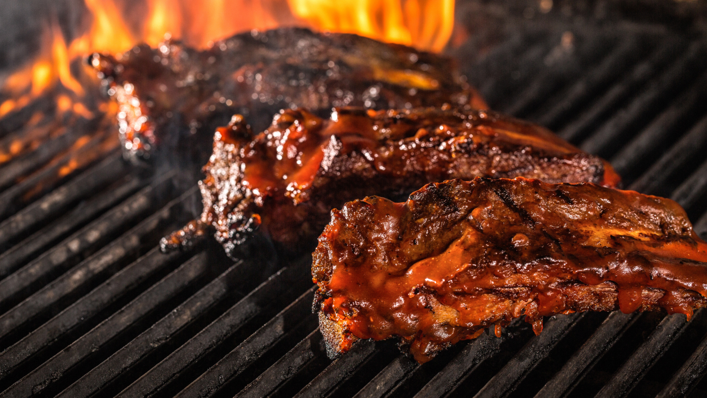
Globally, Tony Roma’s represents the iconic nature of good ole’ American food – brand equity that’s tough to overlook. However, as with all societal greats, an update is needed from time to time to ensure the brand message is continuing to reach new audiences. Leaning into this history, we revitalized the Tony Roma’s digital presence and gave the world a fresh look at an American icon.
Process and Results
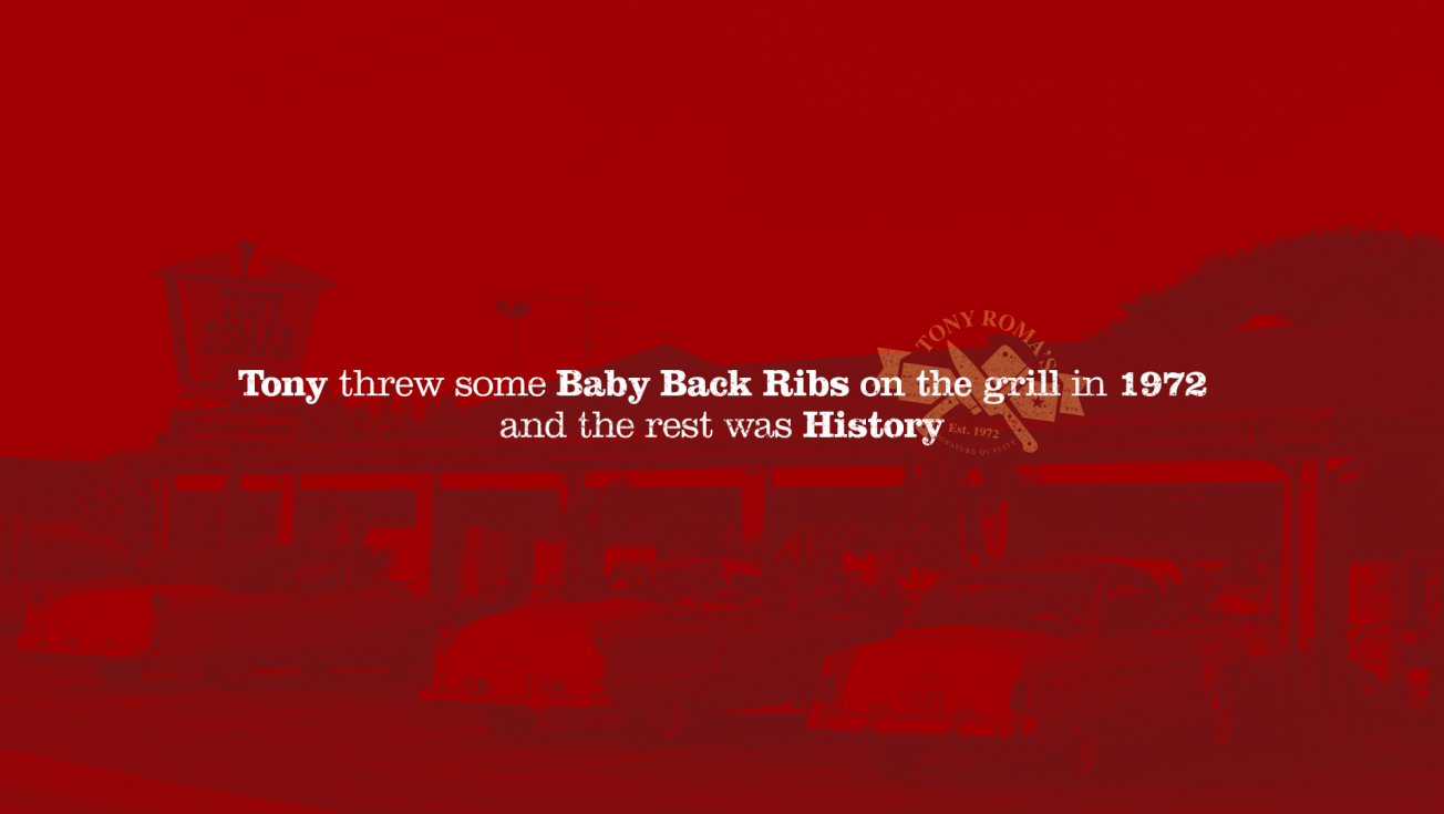
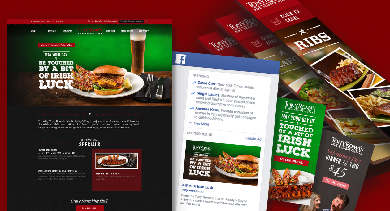
From the start, we dove deep into the architecture and data from the existing website. Research is vital in informing our process and making sure we’re making deliberate decisions, especially in a digital overhaul such as this. What we learned was that we needed to balance tradition with modernity and let the brand’s reputation lead the way. Down-home, hand-made typography alongside updated visual assets brought the user to the table and increased engagement with the brand across the site and social platforms. Having the cornerstone of the site supported ongoing digital campaigns that pushed seasonal and evergreen deals out into the world.
Research & Analysis
UI/UX Design
Web Development
Campaign Development
Full-Service Video Production
Photography
Copywriting
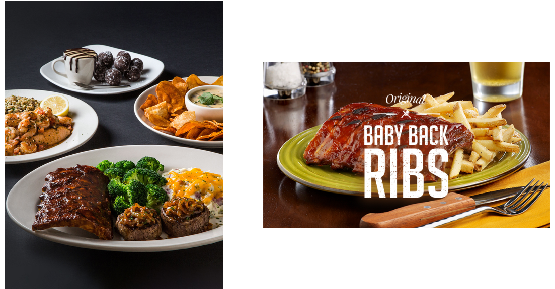
We put food first and kept copy to a minimum to support those mouthwatering cravings inspired by the long history of Tony Roma’s.
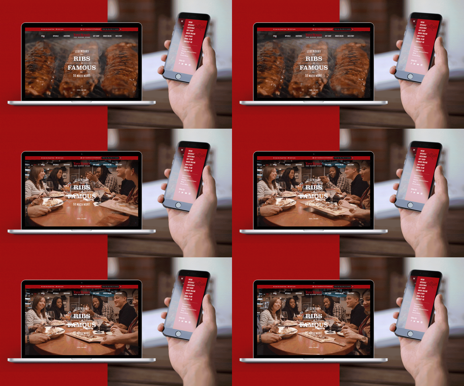
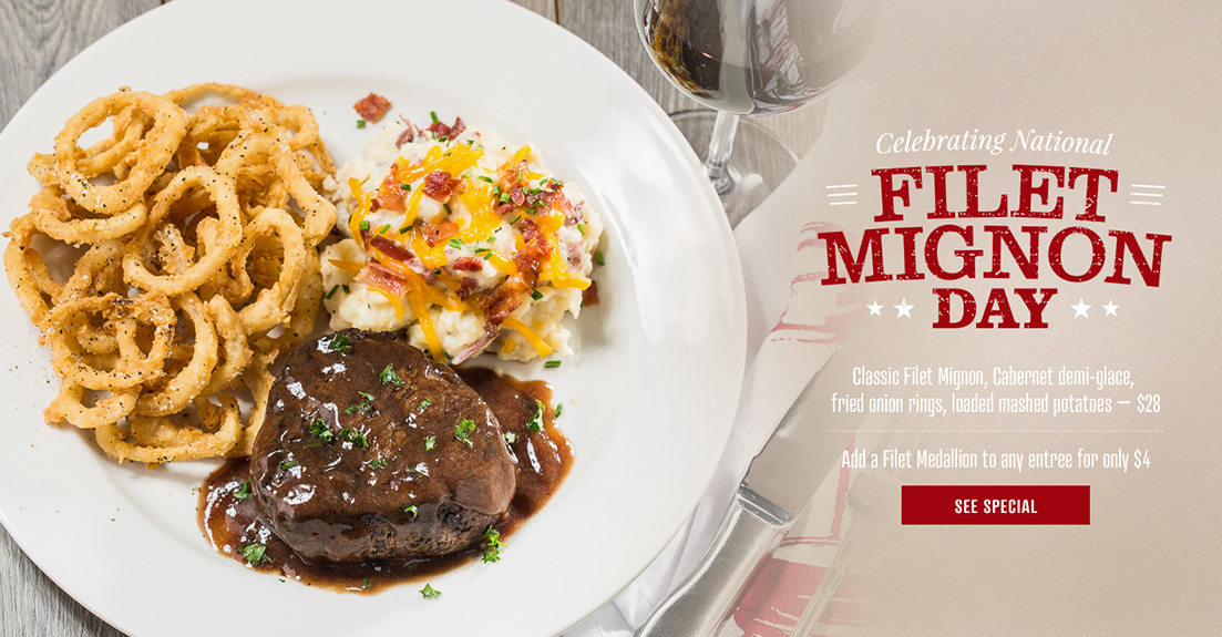
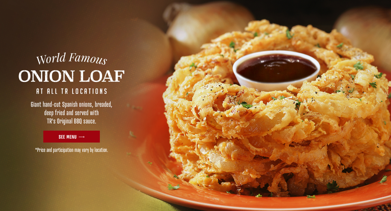
We started from scratch and produced custom visual assets, including full-scale video production, lifestyle, and food photography. Having high-quality, purpose-driven assets gave the site and our campaigns a leg up by keeping the food at the center of the conversation, which helped increase brand engagement and conversion.
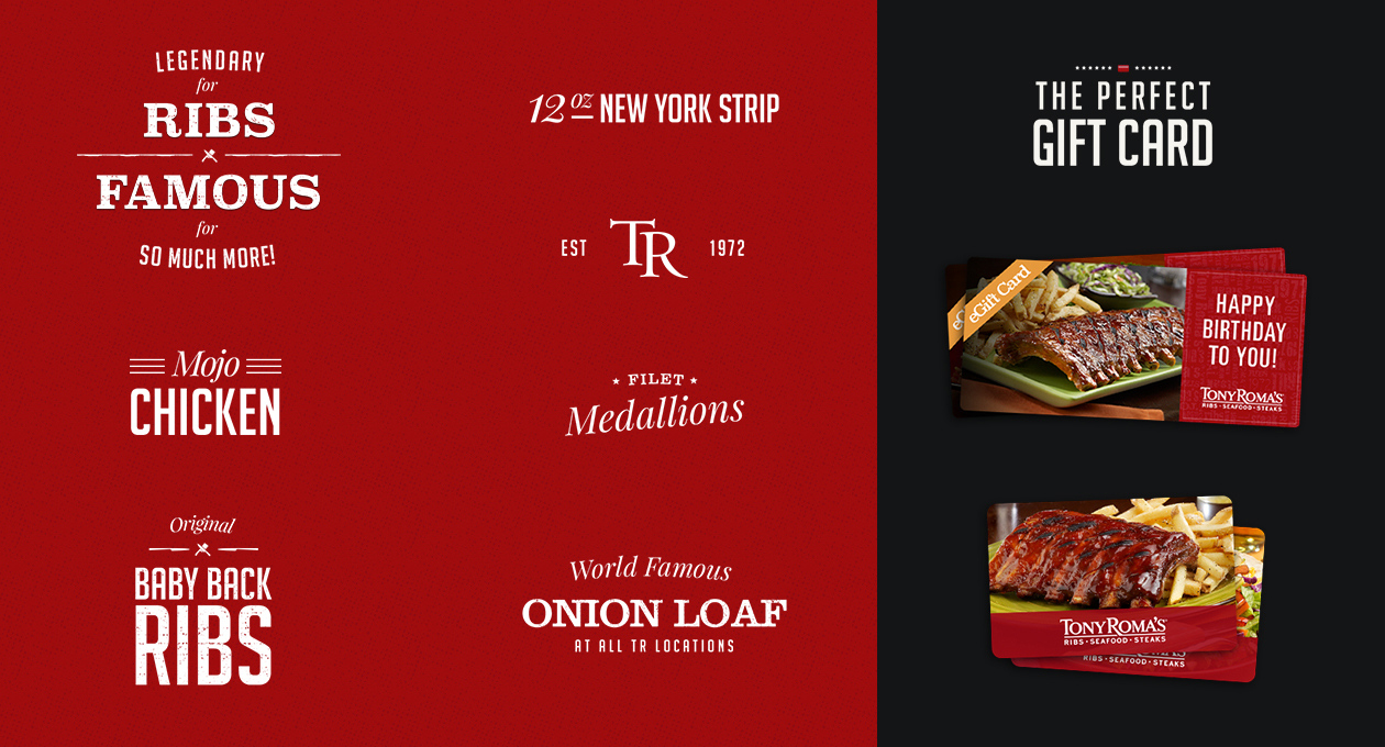
Custom typography paired perfectly with our visual assets to keep the message clear and consistent across all platforms and initiatives. CTR increased, and we created a new life for the digital presence of the brand.
Tell your story.


