Baker Tilly
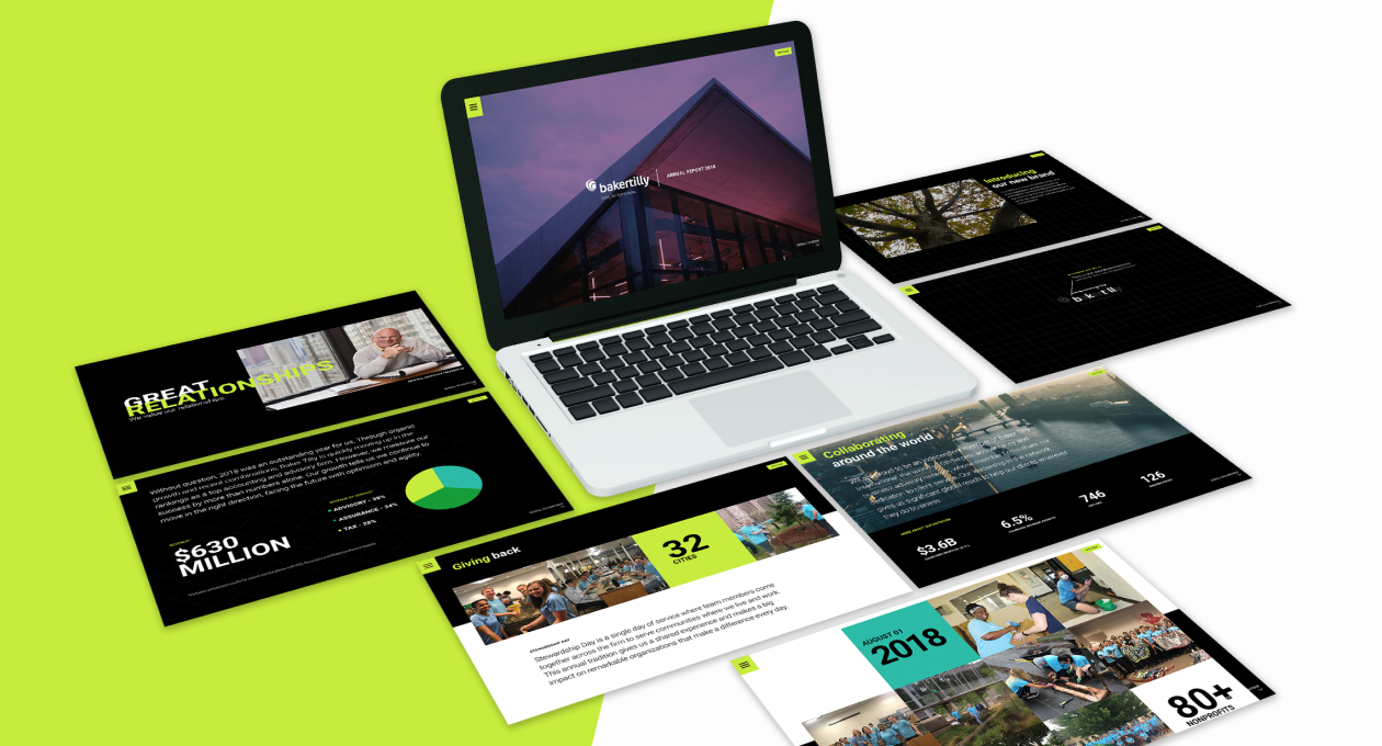
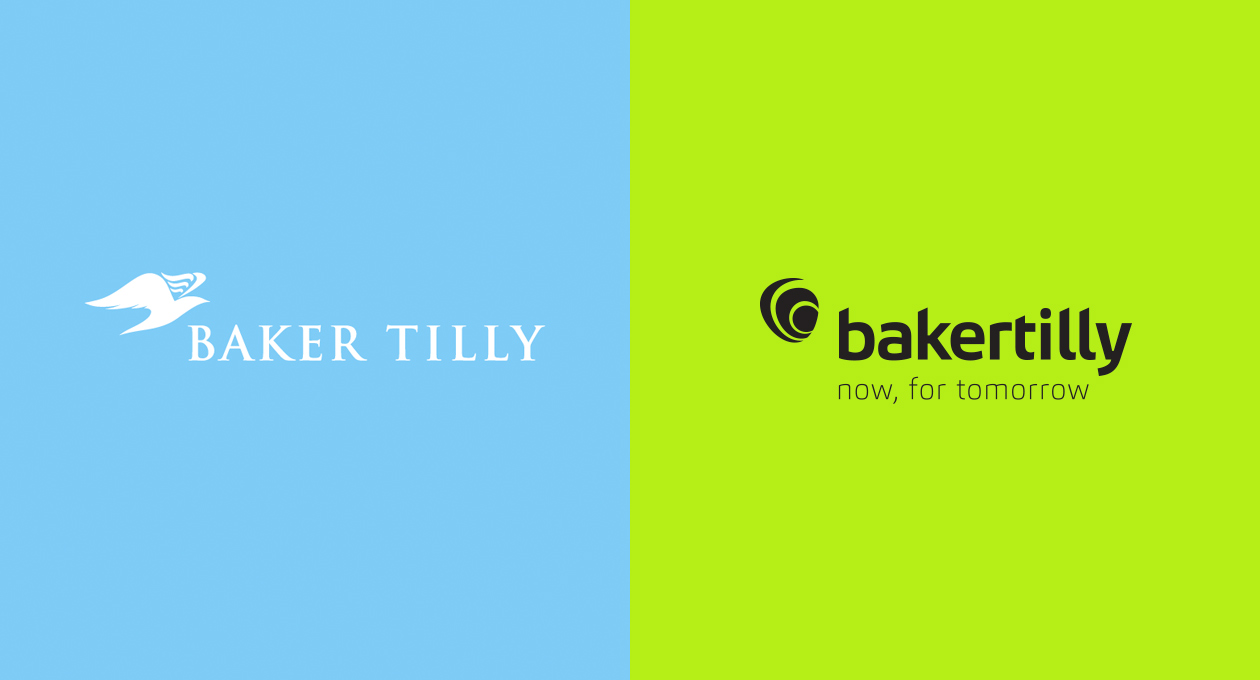
Baker Tilly is the largest individual member firm in the Baker Tilly International network. Due to their size, they have a strong influence on the direction of the brand. A valued client since 2014, we are a true extension of their marketing department. So when it came time to launch their newly refreshed brand in 2018, we decided to wrap the rebrand campaign into the Annual Report, which we produce each year. With this direction, we developed a strong launch strategy that introduced the brand in an exciting way.
Process and Results
We knew we were in the perfect position to set the foundation for a stronger brand moving into the future. Based on the updated guidelines, we began working out the best way to bring to life the brand expressions that would get the firm, and public, excited and educated about Baker Tilly’s future. Our concept showcased a modernized firm, built from the ground up by the people at the organization’s core. From here, we made a plan to capture custom imagery to populate the site and capture stories from the team members we chose to highlight. Our approach was to keep things authentic and honest, which helped streamline the rebranding process and build that excitement we had in mind.
Research & Strategy
Creative Direction
Photography
Animation
UI/UX Design
Web Development
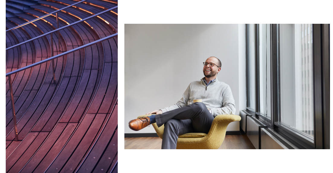
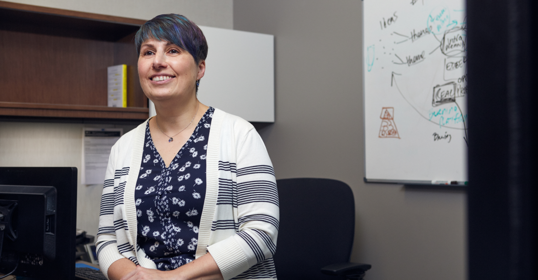
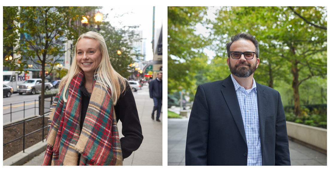
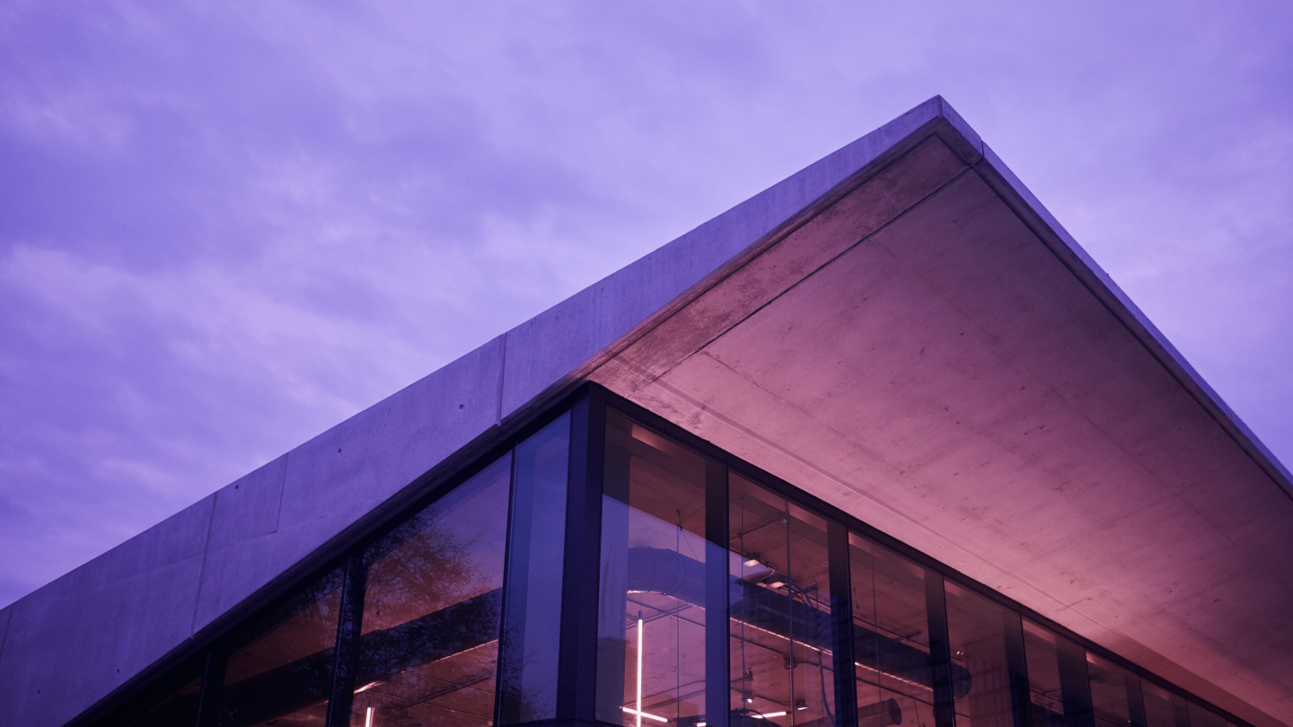
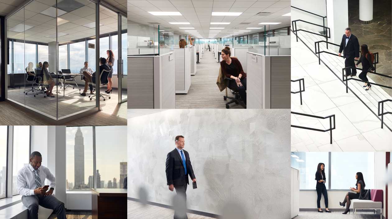
A critical component of the 2018 Annual Report was high-quality, custom photography. Throughout the site design, we designated two key image types: abstract scenery and environmental portraits. Baker Tilly has offices across the United States and Europe, so this was a way to give a subtle nod to their footprint.
Phase two of the rebrand was a full site rebuild. We partnered with Ueno to develop a creative strategy to bring uniformity to the brand’s visual assets. Using the library from the Annual Report as a starting point, we wanted to further dig into the national (and international) presence of Baker Tilly by highlighting the offices they call home. The campaign, entitled People in Places, showed both the human and environmental components of the firm.


It was important for us to capture the character of each office. Baker Tilly boasts an average seven-year tenure, and the pride is evident as you travel between offices. Our goal was to move beyond the expected corporate image and position the firm’s personality front and center.
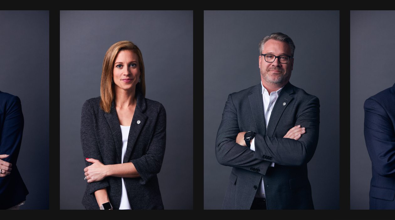
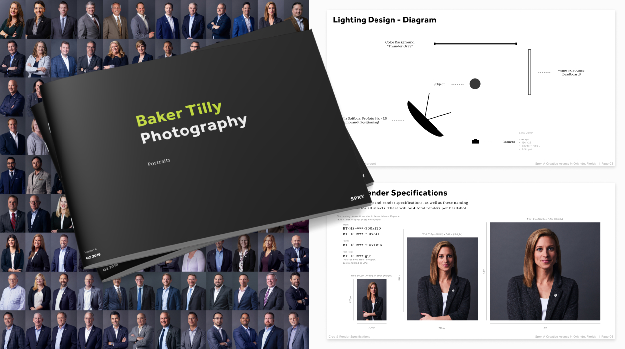
We needed to capture headshots of the core leadership team that felt cohesive with the new brand. For six months, we traveled to five different locations to capture the first 100+ headshots. After setting the standard, we developed a handbook to distribute to photographers across the country so we could cost-effectively complete the remaining leadership team under our management.
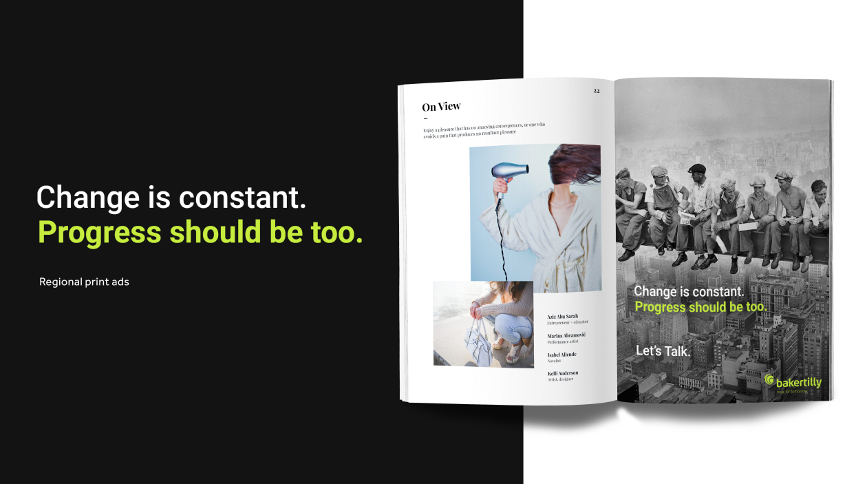
As with any successful rebrand, it’s essential to make sure we reach all appropriate audiences. Professional periodicals are still significant in Baker Tilly’s industry, and we wanted to share the updated position at every possible touchpoint. A series of print ads helped bring us from digital to traditional in an informative and light-hearted way.
Tell your story.


